Japanese Wall Decor – Set of 3 Landscape Art Prints
Japanese Wall Decor – Set of 3 Landscape Art Prints
Couldn't load pickup availability
Bring these three Japanese landscape prints home and you'll understand straight away why they work so well — there's something about the mustard and grey palette that feels calm and considered without being dull. I'd say this is the kind of japanese wall art that looks like you spent ages curating your walls, even if you just ordered it on a Tuesday evening. If you've been looking for japanese wall decor that feels genuinely grown-up and pulls a room together, this set of three is a really strong place to start.
The prints capture a serene Japanese landscape in mustard and grey — warm enough to feel inviting, cool enough to feel modern. They sit naturally in a living room but honestly work just as well in a bedroom or home office. The colour palette is one of those rare combinations that plays nicely with a wide range of furniture tones, from natural oak to dark walnut.
What's Included with this Japanese Landscape Artwork set
- Set of three Japanese landscape wall art prints in mustard and grey
- Printed with pigment inks for bright, lasting colour that won't fade in sunlight
- Designed for indoor use — crafted to maintain colour and clarity over time
- Made to complement modern interiors straight out of the packaging
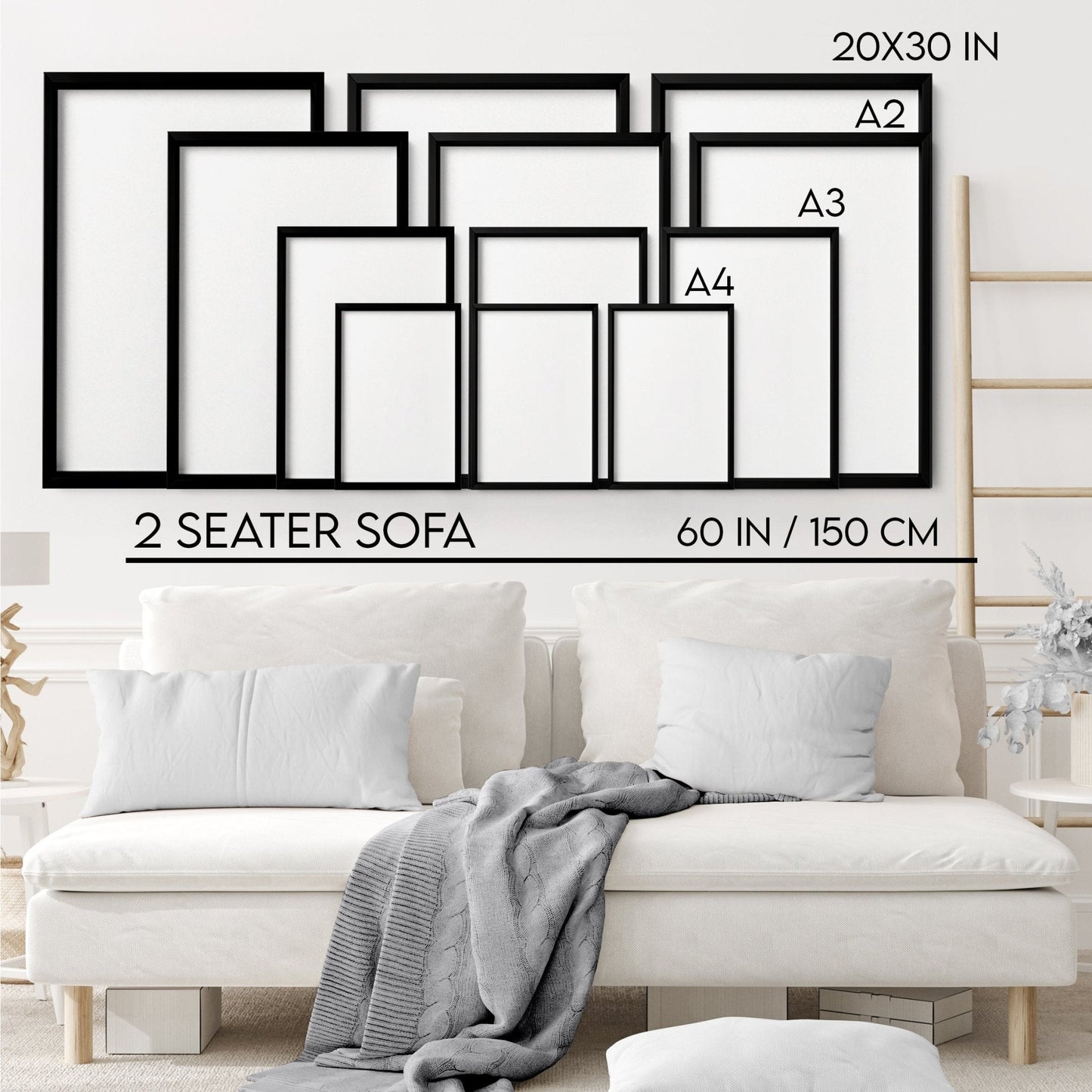
- Choose between framed and unframed options
How to Style japanese wall decor in Your Living Room
I'd hang all three in a row above a sofa or console table, keeping an even gap between each print — around 5 to 8 cm tends to look intentional without feeling rigid. Because the mustard and grey tones are neutral-warm, they sit really well against white, warm cream or even a soft sage wall. If your sofa's linen or oatmeal, these will feel like they were picked specifically for the space. Not sure about the arrangement? Try laying them out on the floor first to get a feel for the spacing before you put a single nail in the wall — it saves a lot of guesswork.
Choosing the Right Finish for This Artwork's Style
Given the palette here — those warm mustards and soft greys — I'd lean towards an oak frame if you want the prints to feel warm and natural, or a black frame if you want a bit more contrast and a sharper, more graphic look. A white frame keeps things light and airy, which works especially well if your walls are already quite pale. If you're going unframed, these prints look brilliant in a simple Ikea-style ribba frame too, so don't feel like you need to spend a fortune to get them looking great on your wall.
Share