Picture for a Kitchen London Bridge Travel Wall Art Prints | "Wintertime in London" | Set of 3
Picture for a Kitchen London Bridge Travel Wall Art Prints | "Wintertime in London" | Set of 3
Couldn't load pickup availability
Hang a picture for a kitchen that actually tells a story — this set of three watercolour-style London travel art prints captures the magic of the city in winter, and every glance at them is a little reminder of why we love this brilliant, bustling place. From Tower Bridge strung with warm gold-toned festive lights to two red-coated Queen's Guards standing proudly outside a snow-dusted townhouse, and finally a soft ochre-leafed Westminster Abbey scene with classic lamp posts framing the view, the three prints work together beautifully as a set.
The palette is wonderfully warm and gentle — creamy beige backgrounds, ochre and amber tones, soft greys and muted blues in the river and sky, with pops of rich red in the Guards' uniforms tying everything together. It's a travel print set with real personality, and it suits kitchens, dining rooms and hallways equally well. If you love London, or you simply want something with a bit of character on the wall, this set delivers that in spades.
What's Included with Picture for a Kitchen London Bridge Travel Wall Art Prints "Wintertime in London" | Set of 3
- A set of 3 individual London travel art prints — Tower Bridge with festive gold-toned lights, Queen's Guards outside a snow-covered townhouse (with the phrase "Wintertime in London" lettered in script), and a Westminster Abbey autumn scene with ochre foliage
- Printed in the UK using fade-resistant pigment inks for lasting colour — designed for indoor use
- Framed and canvas-wrapped options arrive ready to hang, saving you the time and hassle of hunting for a frame that fits perfectly — the unframed option is the print only
- Choose between unframed and framed options in multiple sizes and in Luster or Museum quality; also available in wrapped canvas size options
How to Style a Picture for a Kitchen with a London Travel Theme
I'd hang all three prints in a straight horizontal row at eye level, with an equal gap between each one — it keeps the arrangement clean and the storytelling clear. Above a breakfast bar or along the wall behind a dining table works really well; the soft beige and ochre tones sit happily against white, warm cream, sage green or even a dark navy kitchen wall without ever feeling too busy. Because the prints each feature a different London landmark, they have a lovely rhythm when displayed together — Tower Bridge on the left, the Guards in the centre, Westminster Abbey on the right reads like a little journey through the city.
If your kitchen is on the smaller side and a row of three feels like a lot, try hanging two side by side and placing the third on a nearby hallway wall — they are cohesive enough to work as a pair or trio across adjoining spaces. For a relaxed, homely feel I'd keep the surrounding decor simple: a wooden chopping board, a few dried stems in a neutral vase, and let the prints do the talking. You can browse our full travel wall art collection here for more inspiration: Travel Wall Art Prints.
Choosing the Right Size and Finish for Your Kitchen Walls
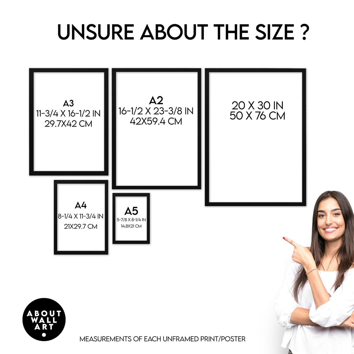
Before you pick a size, measure the wall space you have in mind — not just the width, but the height too. For a standard kitchen wall above a worktop or splashback area, smaller prints in the set often look beautifully considered and intentional. If you have a longer run of wall — say beside a dining table or in an open-plan kitchen-diner — going a size up gives the artwork real presence and lets all that lovely beige and ochre detail breathe. I always say: when in doubt, go slightly bigger than you think, because prints on walls tend to look smaller in person than they do on screen.
For finish, Luster paper gives a gentle sheen that brings out the warm gold-toned and ochre details in the illustrations really nicely, while Museum quality paper has a more matte, gallery feel that suits the watercolour style of these prints beautifully. Both are excellent — it really comes down to whether your kitchen gets a lot of natural light (matte handles bright rooms well) or whether you want a touch more vibrancy in the colours. Scroll down to see how each size looks in a kitchen before you decide.
Share