Japanese Art Frames – Set of 2 Prints
Japanese Art Frames – Set of 2 Prints
Couldn't load pickup availability
Imagine finding the perfect pair of japanese art frames that actually look as good on the wall as they do in your head — these two prints are exactly that. They bring a calm, cultural feel to a room without making it feel overdone or themed, and the warm beige tones mean they sit happily in most spaces without clashing. I love how a set of two feels more considered than a single print; there's a real sense of intention to it. If you've been trying to pull your living room together with something a bit different, this could be it.
The artwork captures the elegance of traditional Japanese art in a way that feels timeless rather than trendy. Both prints work together as a pair, so you're not left trying to match two separate pieces — the set does the hard work for you. They'd look brilliant in a living room, a bedroom, or even a home office where you want something on the wall that actually makes you feel good when you look at it. You can also explore more of our japanese wall art collection if you'd like to build a larger gallery wall.
What's Included with this Japanese Art Print Set of 2
- Printed with pigment inks for bright, intense colours that won't fade in sunlight
- For indoor use only — designed to look their best inside your home
- White mounts are not included
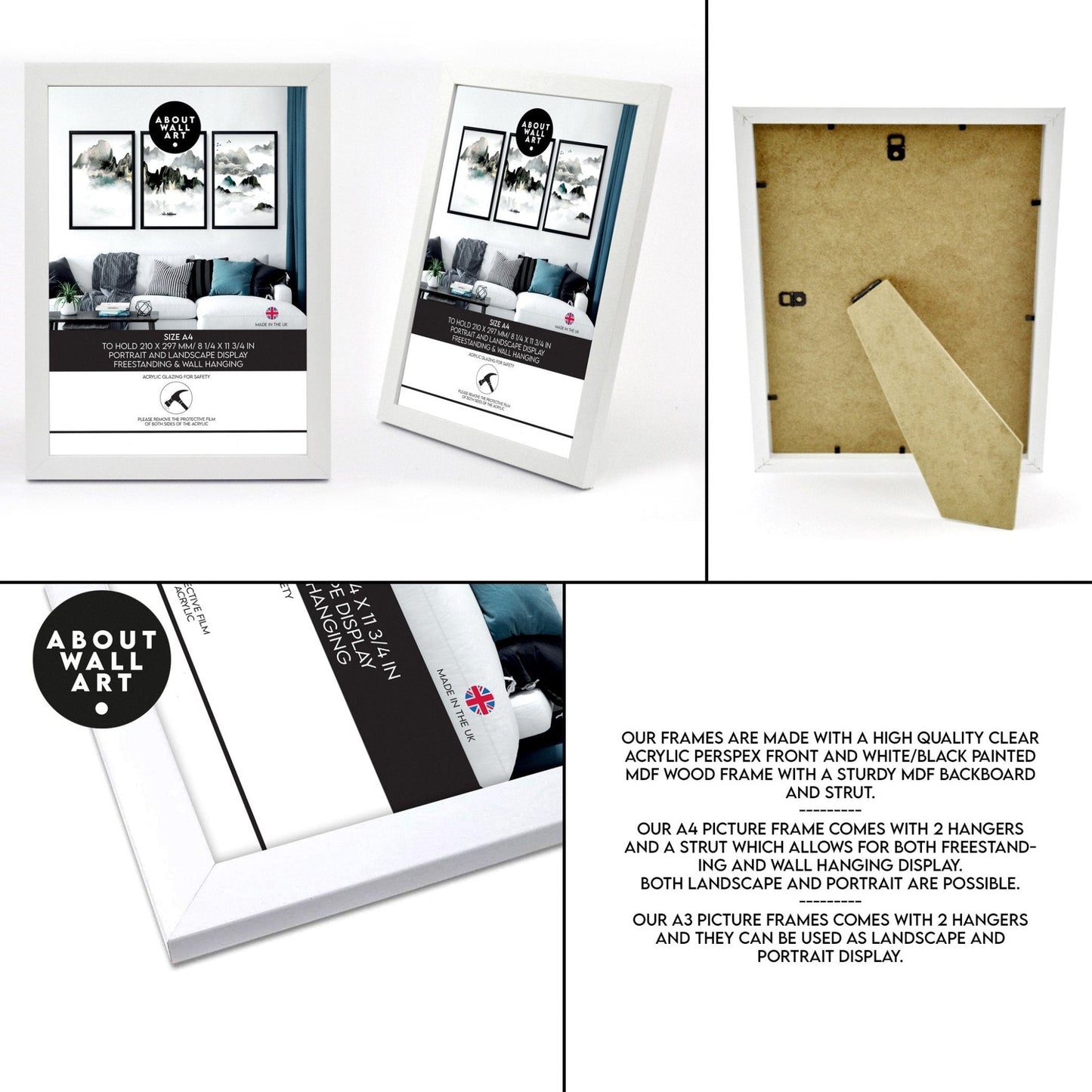
- Choose between framed and unframed options
How to Style Japanese Art Frames in Your Home
I'd hang these two side by side above a sofa or a bed headboard, keeping an even gap between them — around 5 to 8 cm works well. Because the palette is warm beige, they pair really naturally with off-white, warm grey, or even a soft sage wall. If you want something a bit more relaxed, they'd look just as good leaning on a shelf or a console table rather than hung. They also work really well on hallway walls where you want a calm first impression as you walk in — have you got a blank wall there that needs some love?
Choosing the Right Finish for This Artwork's Beige Palette
Because these prints are built around warm, neutral beige tones, the finish you choose makes a real difference to how they land in the room. A black frame gives you a clean, graphic contrast that looks great in a modern or Japandi-style space. A white frame keeps things soft and airy, which I think works beautifully if your room is light and bright. An oak frame is my personal favourite for this palette — the warm wood tone picks up the beige in the artwork and makes the whole thing feel really cohesive. If you're not sure, go for whichever frame colour you already have on your walls and it'll sit right in.
Share